Code
import xarray as xr

from pathlib import Path
from tuw_education_notebooks.view_monthly_ssm import view_monthly_ssm, load_cmap

RESOURCES = Path("data")An example using TU Wien Surface Soil Moisture developed for GHG-Kit
![]()

import xarray as xr
from pathlib import Path
from tuw_education_notebooks.view_monthly_ssm import view_monthly_ssm, load_cmap
RESOURCES = Path("data")Data visualization depends on art to convey stories from data through the combination of geometric objects and color with science. In the ideal case, the information should be easily extractable from the visualization, but at the same time the scientific elements should be to the point accurate. The latter is important because false graphical representations can lead to wrong perceptions and interpretation, which, in turn, lead to wrongful decision making. These mistakes can be made intentionally, and thus be fraudulent, but are more often innocent mistakes with potentially far-reaching consequences. When plotting data on maps we have to consider even more aspects, like the geographic projection, grid types and mapping of variables as a third dimension to a suitable color space.
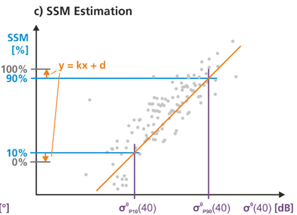
For the examples in this notebook we will use soil moisture developed for GHG-Kit. To retrieve surface soil moisture data we exploit the general linear relationship between Sentinel-1 microwave backscattering and soil moisture. The change detection method developed at TU Wien calculates the driest and wettest condition within a time period, and then relates the observed backscatter values to retrieve the relative soil moisture or “wetness” as a percentage of maximum saturation, as shown in Figure 2.1.
For the examples we will show a subset of data over Austria. In Austria, two prominent challenges for soil moisture detection appear:
In the Soil Moisture Product developed for GHG-Kit, we address these challenges by using radiometric terrain-corrected backscatter data to “flatten” the terrain and static spatial filtering of dense vegetation at high resolution (See Supplement).
In the following lines we load a subset of the soil moisture dataset with xarray, which is stored as a Zarr archive.
SSM_dc = xr.open_zarr(RESOURCES / "SSM-CD-SIG40-R-DVEG_2018.zarr/")
SSM_dc
<xarray.Dataset> Size: 8GB
Dimensions: (time: 723, y: 1200, x: 1200)
Coordinates:
* time (time) datetime64[ns] 6kB 2018-01-01T05:08:47 ... 2018-12-31...
* x (x) float64 10kB 4.8e+06 4.801e+06 ... 5.399e+06 5.4e+06
* y (y) float64 10kB 1.8e+06 1.799e+06 ... 1.201e+06 1.2e+06
Data variables:
band_data (time, y, x) float64 8GB dask.array<chunksize=(100, 100, 100), meta=np.ndarray>
spatial_ref int64 8B ...
We resample this dataset along the time dimension thereby aggregating surface soil moisture as mean values over months.
SSM_dc_monthly = SSM_dc.resample(time="ME").mean().compute()
SSM_dc_monthly
<xarray.Dataset> Size: 138MB
Dimensions: (time: 12, y: 1200, x: 1200)
Coordinates:
* x (x) float64 10kB 4.8e+06 4.801e+06 ... 5.399e+06 5.4e+06
* y (y) float64 10kB 1.8e+06 1.799e+06 ... 1.201e+06 1.2e+06
* time (time) datetime64[ns] 96B 2018-01-31 2018-02-28 ... 2018-12-31
Data variables:
band_data (time, y, x) float64 138MB 88.5 91.39 89.86 ... nan nan nan
spatial_ref (time) int64 96B 0 0 0 0 0 0 0 0 0 0 0 0
Now we are ready to plot the monthly soil moisture data on a map. To plot one variable like soil moisture on the x (longitude) and y (latitude) dimensions requires finding a good representation in a 3D colorspace. This is also referred to as pseudocoloring: a method for revealing aspects of the data over a continuous plane. For effective pseudocoloring we need to find the correct colormap. We can ask ourselves the following questions:
In most situations, we can consider one of three types of colormap:
In the following maps we can see what can go wrong when we don’t take these aspects into consideration.
view_monthly_ssm(SSM_dc_monthly, "seismic")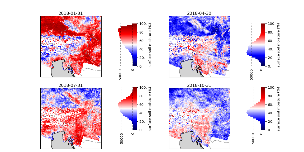
What went wrong in the above maps? The first mistake is that we took a diverging colormap, although the data does not have a critical middle value. The sharp contrast between the blue and red further make it appear as if the data is binary, but in reality we have uniformly spaced values from a sample distribution that approximates a normal distribution (as can be seen from the histograms). On top of that, we have picked a colormap which includes white. There is also information in what we don’t see on these maps: e.g. missing data points. But by choosing to include white we give the false impression of missing data where we actually have a soil moisture saturation of 50%.
Let’s fix the first problem. We do this by choosing the sequential “viridis” colormap. In this colormap the color is a linear function of the variable with a very wide perceptual range (e.g. it is very colorful). Viridis is, furthermore, colorblindness friendly and prints well in grayscale while preserving perceptual uniformity and breadth of the range.
view_monthly_ssm(SSM_dc_monthly, "viridis")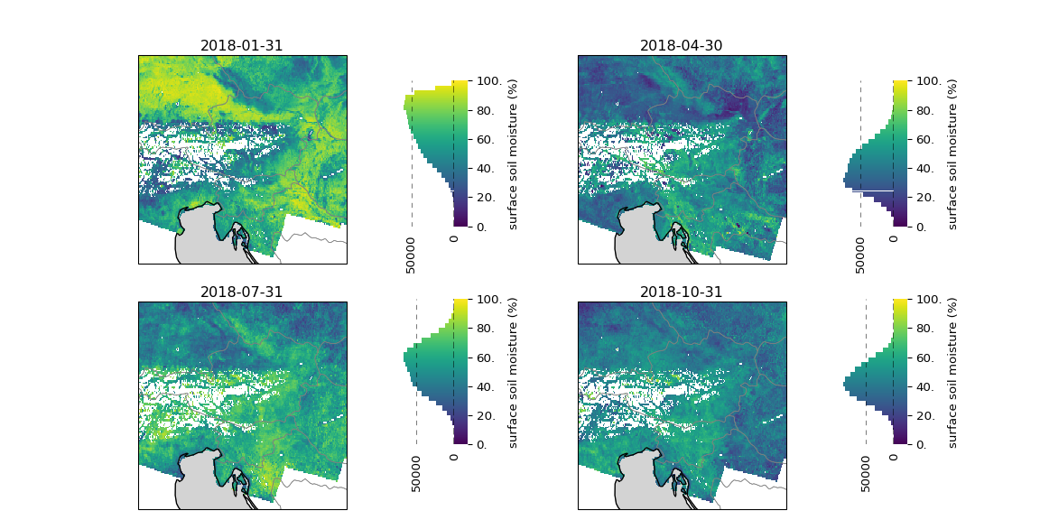
This colormap fixes the previous issues. We see much more nuance in the variance of soil moisture. Foremost we also see that we have actual missing data points. There is a whole area in the Alps that is not well covered. This is actually a well known effect of the measurement technique. We cannot address all geometric effects with radiometric terrain correction in microwave remote sensing. In very steep regions like the Alps, we still have to mask the data due to shadowing and layover effects. Shadowing occurs when the terrain is so steep that it blocks the view of subsequent points, preventing any measurements and obstructing scene reconstruction (See Supplement for more information).
This last step is more subjective and relates to the psychology of colors: the multiple meanings and feelings that people associate with a color. Here we use a color gradient developed by TU Wien that transitions from dark brown for dry soils to blue for wet soils.
SSM_CMAP = load_cmap(RESOURCES / "colour-tables/ssm-continuous.ct")
view_monthly_ssm(SSM_dc_monthly, SSM_CMAP)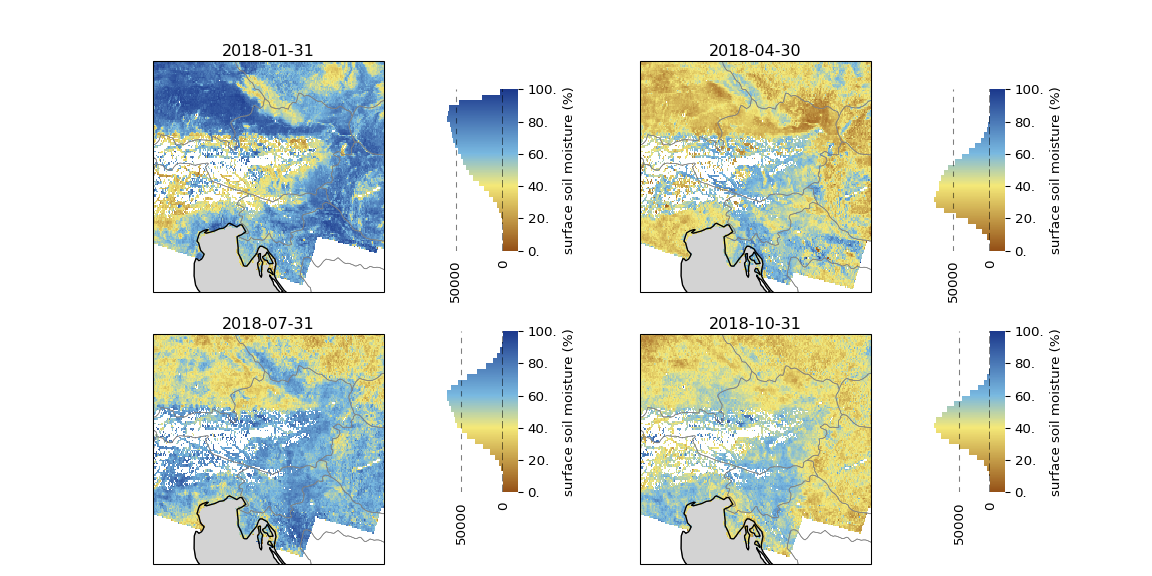
In this last rendition of the maps we have a nice relation between color and soil moisture, where the dark brown color evokes images of dried-out soils and the blues of water saturated conditions.
Microwave backscatter has a strong dependency on the viewing angle, meaning that the backscatter measured varies a lot depending on the angle we are looking at the ground. The incident angle under which the ground is viewed from a Sentinel-1 sensor, depends on its orbit. To correct for this, Bauer-Marschallinger et al. (2019) developed a method to normalise to a common incident angle of 40 degrees. However, this method assumes relatively flat topography and can fail in steep and varied terrain. Therefore, we use a high-resolution digital elevation model (DEM) to correct the backscatter at high resolution before up-sampling to 500 meters and normalizing to the common incident angle.
Dense vegetation can obstruct the signal from the soil, or it might be so weak that it’s indistinguishable from noise. To amplify the signal over densely vegetated areas Massart et al. (2024) developed a spatial filtering method to mask dense vegetation at high resolution before up-sampling to 500 m. By doing this the 500 m pixel contains a stronger signal from the soil, facilitating easier soil moisture retrieval.
Layover occurs because microwave radar measures the distance between the sensor and a point on the ground. In very steep and high terrain, the terrain is “closer” to the sensor, shortening the measured distance and causing the point to appear before others in the raster.
